Monday, 20 June 2011
My Game ( Rock Throw )
This first clip is the starting screen you press on the start to start the game, i have put a black layer over the top of the background and i have lowered the opacity so it has more of an outer game feel to it so you know when the games is commencing and when it is just in the background
This second image is of the game play all the scenery was made in illustrator you can see the scoreboard at the top right the lives on the bottum right and the throwing option at the bottum left, the thowing option on this section is figuring out the direction that you would like the throw the rock so that you hit the stump.
This thirst one is showing the curve of the rock when you throw it , later in the game there will be obsticals to curve the rock around inorder to hit the target, as you can see the score goes up in ones so when you hit the stump you get a point ect ect.
This part of the throwing option is the power, the gradiant goes up and right back down again goin from green to yellow to red to show how hard you throw it , as you can see in this image the player has lost a life, you lsoe a life when you miss the target, you get three lives.
This is the screen that comes up when it is game over, after about 5 second the game will restart and go back to the original screen where it says start,
Token in my game.
My Target / Token
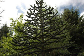
This is the token i will be using in my game it is a simple tree trunk, the image on the right is the photo image i took on the Dartmoor trip, i then vectorised it in illustrator and treated my target / token. the aim of my game is the hit this target with my character which is a stone with a face, the reason i chose to use this shape is because when i first saw it when i was on Dartmoor the first thing i thought was target to hit with a stone , it was an instant idea, this trunk gave me a lot of inspiration for my piece.
Dartmoor photos
I took this image as i thought it had an interesting feeling of depth in the photo lots of textures and shapes created by the leaves and the branches.
I took this image because the brances was made up of simple shapes and lines and it reminded me of the mario brothers trees in the games.
I took this image because i liked the view of the hills and the rocks and the texture of the sky.
I took this photo because i liked the distance of the photo how you get the the edge of the land and it just seems to drop off .
I took this photo because i liked the hight that i took the image from made all the trees at the bottom look really small.
I took this photo as i thought it was a great view with the mix of colours with the fields and the water and the sky.
I took this photo as i liked the light shining threw the sky and how dark and mysterious the moors look with the over shadow of clouds.
I took this photo as I liked the slight hint of blue that you get from the sky.
I took this photo as i liked the texture that the rock has with the lines and wrinkles.
I took this photo because i liked the texture and colours of the rock.
I took this photo because i wanted a nice full view of the whole rock and how it blends so well into the scenery.
I took this photo because you have a varied shapes of rocks and shades.
I took this photo as i liked the tree, and how it was jsut randomly growing in the middle of all the rocks.
I took this photo as i liked the mossy rock how colours from the ground almost blended in with the rock like camouflage.
I took this photo as i found it interesting how the tree leans into the hill like it was trying to stand up and keep balanced on the hill.
I took this photo because i liked the sense of distance and mystery you have as you look into and threw the trees.
I took this photo as i liked the round shape of the trunk almost like a target, i later used this tree trunk in my game.
I took this photo as i liked the way the tree was pointing up with the base of the tree showing , like a distance target.
I took this photo as i liked the was the hut looked so natural in that environment, i also thought of using it in scenery for my game.
I took this photo as i liked the texture that the water made when i kicked pebbles into it.
Monday, 13 June 2011
Signs

These are examples of road signs as you can see some are circler some are rectangular and some are triangular, the circular ones mean Mandatory as on you have to obey these signs, the Triangular ones mean Cautionary which means it is warning you of approaching roads and obstacles, The rectangular signs mean Informatory which is giving you information about the road area, parking and telling you about close building hospitals petrol station ect.
Tuesday, 7 June 2011
Task 2
This is the original object that i had to make my line drawing from, it is a decorative kettle, looking at this object , it was all made up of simple lines and curves, i chose these 3 angels to do my line drawing of i felt this way we saw the 3 angles and point of views to create a good idea of the shape of the object. first thing i notised about this kettle is that it was even it had looked like it was hand made which means what ever angle you shot it from there was a slight different in shape, i would not use this object in my final piece but it was great to get some experience in line drawing and breaking an object down to its simple shapes.
This is the kettle once i turned it into a line drawing, basically i used the pen tool in illustrator to go around the original picture so i cud get the basic shape, the hardest part was going around the Handel as it wasn't even, as you can see from each angle of the kettle is different shape, due to the simple shape and texture of it there wasn't much need for any lines to show texture or shape within the object, the only part i struggled with was getting the spout to show when it was facing you, i got around this by drawing a circle and a few lines coming from it, this is a very very simple line drawing done to depict the shape of the kettle not to show in full detail the definition has been ignored in these images.
This is my kettle once it had been coloured in, just by puttin simples colour in the line drawing it has already created a more real look to it, it has gone from being boring lines to an actual cartoon, i did this by taking my lines and uploading them into photoshop, then creating another layer and colouring over the kettle image with the different colours then highlighting the white area around the line objects going onto the painted area and erasing the white area so the colours were only inside of the lines, this was a simple technique but i feel it worked really well in capturing the colour and the texture of the kettle and the tone stands out really well around the spout.
This activity i found very interesting, it helped me to depict simple shapes from objects and make them into a cartoon, i feel using this technique i can capture the shapes i need to create my game plan and game design, i feel i learnt a new technique and also i increased my skill with the pen tool.
Monday, 6 June 2011
Task 1

Matt Groening
This is as example of a line drawing by the renowned artist Matt Groening, the create of the simpsons, futurama and other cartoon style things. This line drawing of THE SIMPSONS is a prime example of how cartoons start out , as you can see in the grey lines is the main stance and shape of the characters then in the blue and red lines is the shape of the actual characters. this media works by first creating these drawings in a story line sequence, then computerise the images to put them into a story motions, but all cartoons will start from a simple line drawing like this one.
Ways in which the artist has potrayed each character is with lil details, like the carefree Bart is sorta stook hunched over like yhh i dont care, all the female characters all have eye lashes drawn in , and the baby maggie, rather than having a mouth she has a dummy which symbolises the age difference between lisa the girl and maggie the baby as they have the same look facial wise. I really like the shapes and designs that go into the simpsons characters, i would like a look simular to this with my character designs.

Satoshi Tajiri
This is an example of a line drawing of a pokemon, created by Satoshi Tajiri, this is a pokemon called riacho, this is a simple line drawing which was first done on paper then converted into a digital file. the way in which the creator has portrayer this character is making it look so cute and adorable, but with the lightning type tail you can see that it can pack a punch. This simple line drawing makes up the basic shape and design of the pokemon, this will later be filled with gradient colours which will make the full pokemon ready to be edited into an animation. you can see the simple shapes that make up the character the circles and straight lines and simple lines , but as soon as the colour is put into this it brings it all together and it works really well. i would use the technique of using simple shapes to make up my character like circles lines and curves, and then i will fill in these characters with gradients to make my full character, this line drawing was a great piece of inspiration for me .


Lady Godiva
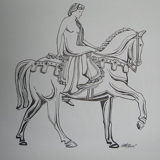
This is a line drawing done by Lady Godiva it is a very classic look, using thick lines for shading and thin lines together to get the tone and the shape of the horse in, it is also quite abstract, i find this form of line drawing very interesting how she uses different thickness of line to get the tones and the shading, it is almost in form of tribal with the different lines and the flicks, this peice has been done using a simple tip pen, it is very simple plan of doing it but i find it very effective and if you got the skills it can work out into a very nice peice, i like the style of the lines i think i may use this is my character design in terms of doing the hair and maybe to bolden out some of the muscles. then using gradiants behind that i will create my characters or scenery.


Thom Yorke
This is a line drawing by Thom Yorke this is a very bold style of line drawing he used thick black lines to get the shape and tone of this face, as you can see rather than shading he just uses outlines to distinguish levels in the hair and things like that. using shapes and curves he has mate the stubble of his beard and the style of his hair so rather than one simple outline of the hair he has goes each bulk of hair combed in a certain direction, i really like this style of line drawing, i expecially like the way he had captured the style of the hair, it had a very modern look, the artist has given this face like a ruff look like if you was to see that face youd think like he is a typical man no time to shave, just your average man, and he does this by showing the lenth of the stubble and the style of his hair and clothing. i like this style and i am thinking og using it for my character to do the hair like this one has done it with the curved shapes and thick bold lines.

Lynne Taetzsch
This is a peice of line art done by Lynne Taetzsch it is a very abstract peice made up of random lines a squiggles, altho this peice is not dipicting any real shape or form it still works really well with the different line thicknesses and shapes, this peice is not dipicting any real person but jsut from looking at it you can sort of get a feeling into what mood the artist was in at the time when she drew this piece, like happy with big wide swirls but confused with little thin wobbly lines, but the good thing about this piece is that every different person will be looking at it in different ways, this i think was done with a piece of charcoal and i feel it was done quickly as well maybe with a bit of finger smudging, they way i may incorporated this into my design is the flow of the lines just how they gently flow around the page and into each other, id want maybe a smooth look to my character some thing that just works and is simple to look at.
Wednesday, 11 May 2011
Draw Me A Story Museum
The Art Of Illustration for Children.
Alot of the art work i saw at the draw me a story exsibit at the plymouth museum was bassed on very simple line drawings with different types of fill in them, some were of different gradiants and some were jsut simple bold colours, but as these animations are for kids it only really has to get ur attention and be the right shape inorder for the children to be interested, uses of lots of primary colours is usually done in these cases.
Alot of the art work i saw at the draw me a story exsibit at the plymouth museum was bassed on very simple line drawings with different types of fill in them, some were of different gradiants and some were jsut simple bold colours, but as these animations are for kids it only really has to get ur attention and be the right shape inorder for the children to be interested, uses of lots of primary colours is usually done in these cases.
Subscribe to:
Comments (Atom)


