Matt Groening
This is as example of a line drawing by the renowned artist Matt Groening, the create of the simpsons, futurama and other cartoon style things. This line drawing of THE SIMPSONS is a prime example of how cartoons start out , as you can see in the grey lines is the main stance and shape of the characters then in the blue and red lines is the shape of the actual characters. this media works by first creating these drawings in a story line sequence, then computerise the images to put them into a story motions, but all cartoons will start from a simple line drawing like this one.
Ways in which the artist has potrayed each character is with lil details, like the carefree Bart is sorta stook hunched over like yhh i dont care, all the female characters all have eye lashes drawn in , and the baby maggie, rather than having a mouth she has a dummy which symbolises the age difference between lisa the girl and maggie the baby as they have the same look facial wise. I really like the shapes and designs that go into the simpsons characters, i would like a look simular to this with my character designs.

Satoshi Tajiri
This is an example of a line drawing of a pokemon, created by Satoshi Tajiri, this is a pokemon called riacho, this is a simple line drawing which was first done on paper then converted into a digital file. the way in which the creator has portrayer this character is making it look so cute and adorable, but with the lightning type tail you can see that it can pack a punch. This simple line drawing makes up the basic shape and design of the pokemon, this will later be filled with gradient colours which will make the full pokemon ready to be edited into an animation. you can see the simple shapes that make up the character the circles and straight lines and simple lines , but as soon as the colour is put into this it brings it all together and it works really well. i would use the technique of using simple shapes to make up my character like circles lines and curves, and then i will fill in these characters with gradients to make my full character, this line drawing was a great piece of inspiration for me .


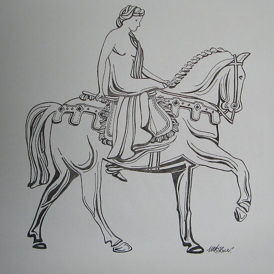
Lady Godiva
This is a line drawing done by Lady Godiva it is a very classic look, using thick lines for shading and thin lines together to get the tone and the shape of the horse in, it is also quite abstract, i find this form of line drawing very interesting how she uses different thickness of line to get the tones and the shading, it is almost in form of tribal with the different lines and the flicks, this peice has been done using a simple tip pen, it is very simple plan of doing it but i find it very effective and if you got the skills it can work out into a very nice peice, i like the style of the lines i think i may use this is my character design in terms of doing the hair and maybe to bolden out some of the muscles. then using gradiants behind that i will create my characters or scenery.


Thom Yorke
This is a line drawing by Thom Yorke this is a very bold style of line drawing he used thick black lines to get the shape and tone of this face, as you can see rather than shading he just uses outlines to distinguish levels in the hair and things like that. using shapes and curves he has mate the stubble of his beard and the style of his hair so rather than one simple outline of the hair he has goes each bulk of hair combed in a certain direction, i really like this style of line drawing, i expecially like the way he had captured the style of the hair, it had a very modern look, the artist has given this face like a ruff look like if you was to see that face youd think like he is a typical man no time to shave, just your average man, and he does this by showing the lenth of the stubble and the style of his hair and clothing. i like this style and i am thinking og using it for my character to do the hair like this one has done it with the curved shapes and thick bold lines.

Lynne Taetzsch
This is a peice of line art done by Lynne Taetzsch it is a very abstract peice made up of random lines a squiggles, altho this peice is not dipicting any real shape or form it still works really well with the different line thicknesses and shapes, this peice is not dipicting any real person but jsut from looking at it you can sort of get a feeling into what mood the artist was in at the time when she drew this piece, like happy with big wide swirls but confused with little thin wobbly lines, but the good thing about this piece is that every different person will be looking at it in different ways, this i think was done with a piece of charcoal and i feel it was done quickly as well maybe with a bit of finger smudging, they way i may incorporated this into my design is the flow of the lines just how they gently flow around the page and into each other, id want maybe a smooth look to my character some thing that just works and is simple to look at.

No comments:
Post a Comment